|
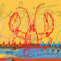
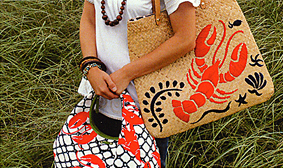
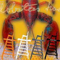
KATE SPADE
GREENWICH, CONNECTICUT We were asked to create a series of "lobster" pieces to tie in to the graphic look of the 2007 Cape Cod Collection product line and at the same time convey the tone and personality of the Kate Spade brand. We are currently working on a proposal for a suite of pieces for each of their retail locations that would include paintings, silkscreens, fine art prints and photo/art montages. The theme of each suite will reflect the culture, personality and location of each boutique. More samples of the artwork we created for Kate Spade can be seen in the Case Studies Gallery. |